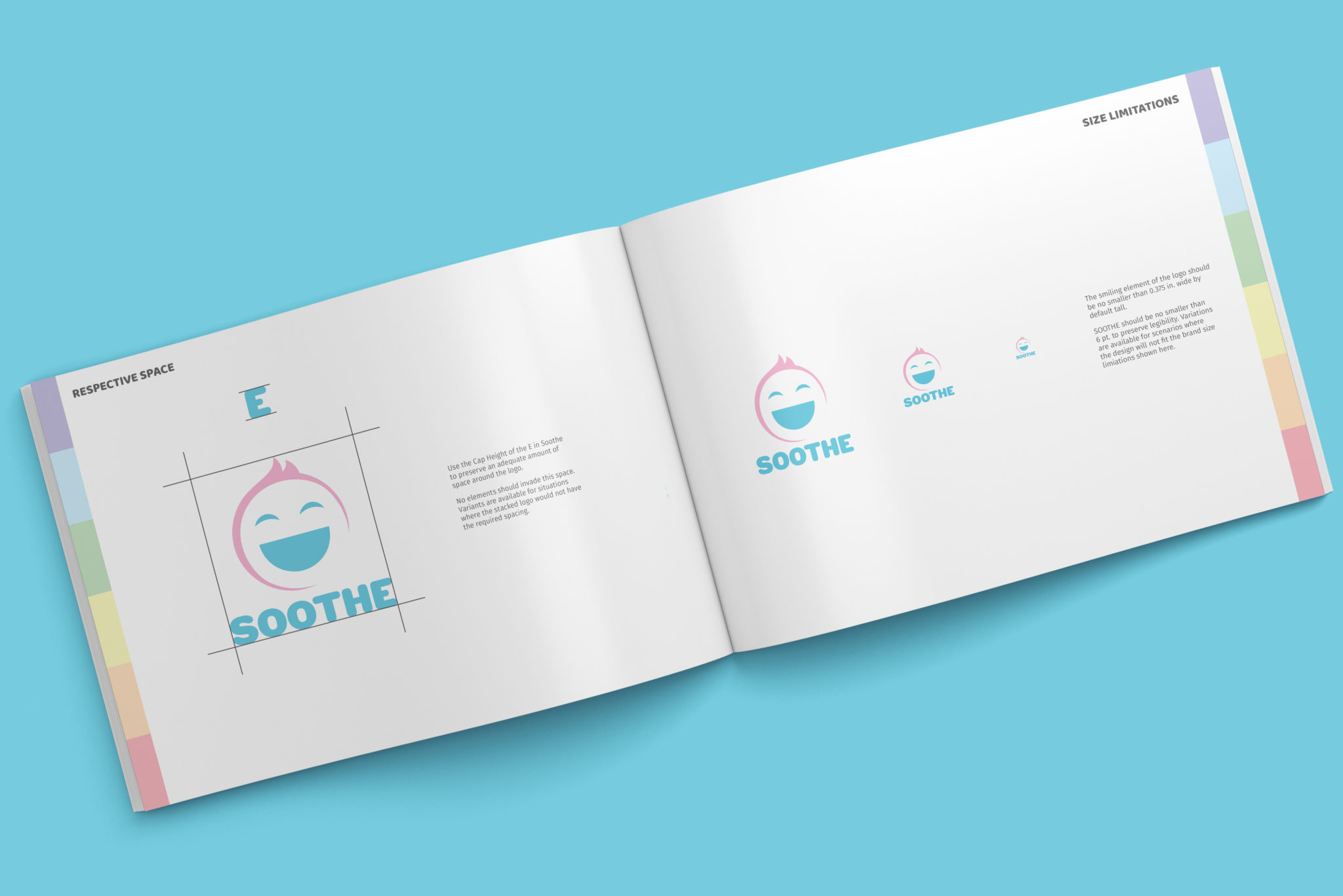
SOOTHE BRANDING PROJECT |
A cohesive branding project for a health and wellness company assigned in my advanced studio course during college. Soothe is a theoretical health and wellness company looking for a brand-wide revamp. I chose to target parents and younger children as my audience through the use of light pastels and soft typography.
The items displayed on this page were created with a mix of Adobe Suite programs including Illustrator, Photoshop, and InDesign.
LOGO DESIGN |
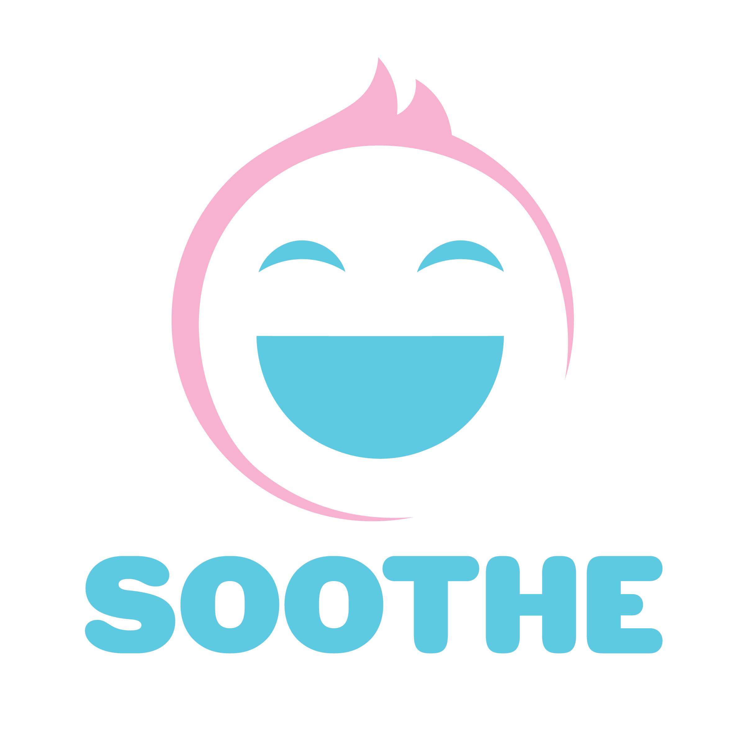
I created this logo in Adobe Illustrator after 40-50 thumbnail sketches. I wanted to create a logo that was modern, yet soft and friendly enough that it would appeal to adults looking for the best care for their children, and also appeal to the children due to it’s joy-like nature.
Entirely created in Adobe Illustrator, the primary smiling face section of the logo was created with careful demonstrations of the pen tool, while the word soothe is typeface HWT Gothic Round.
When it came down to the colors, I wanted a bold, yet neutral color scheme. I decided upon a muted pink with the eyes and wording in a sharp teal to give emphasis and importance to the type and the smiling face itself, while the boundaries of the face stayed subtle.
BANDAGES |
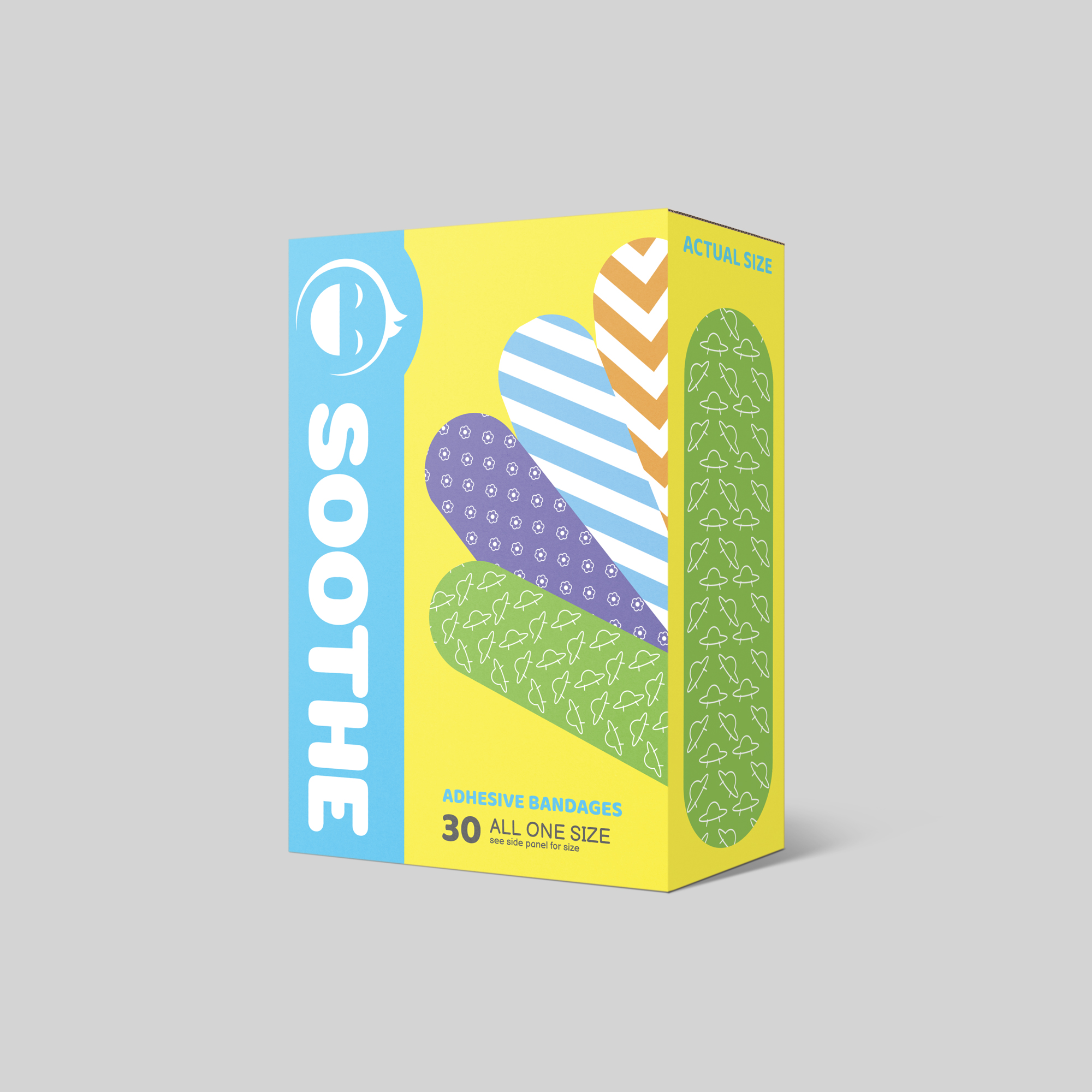
These bandages were designed with all ages in mind. Simple striped bandages alongside subtle patterns to fit children of all ages and styles. All package design elements were created using Adobe Illustrator. The bandage shapes and patterns were also created using Illustrator. The final product was mocked up using commercial-use friendly .PSD files.
SENSITIVE SOAP |
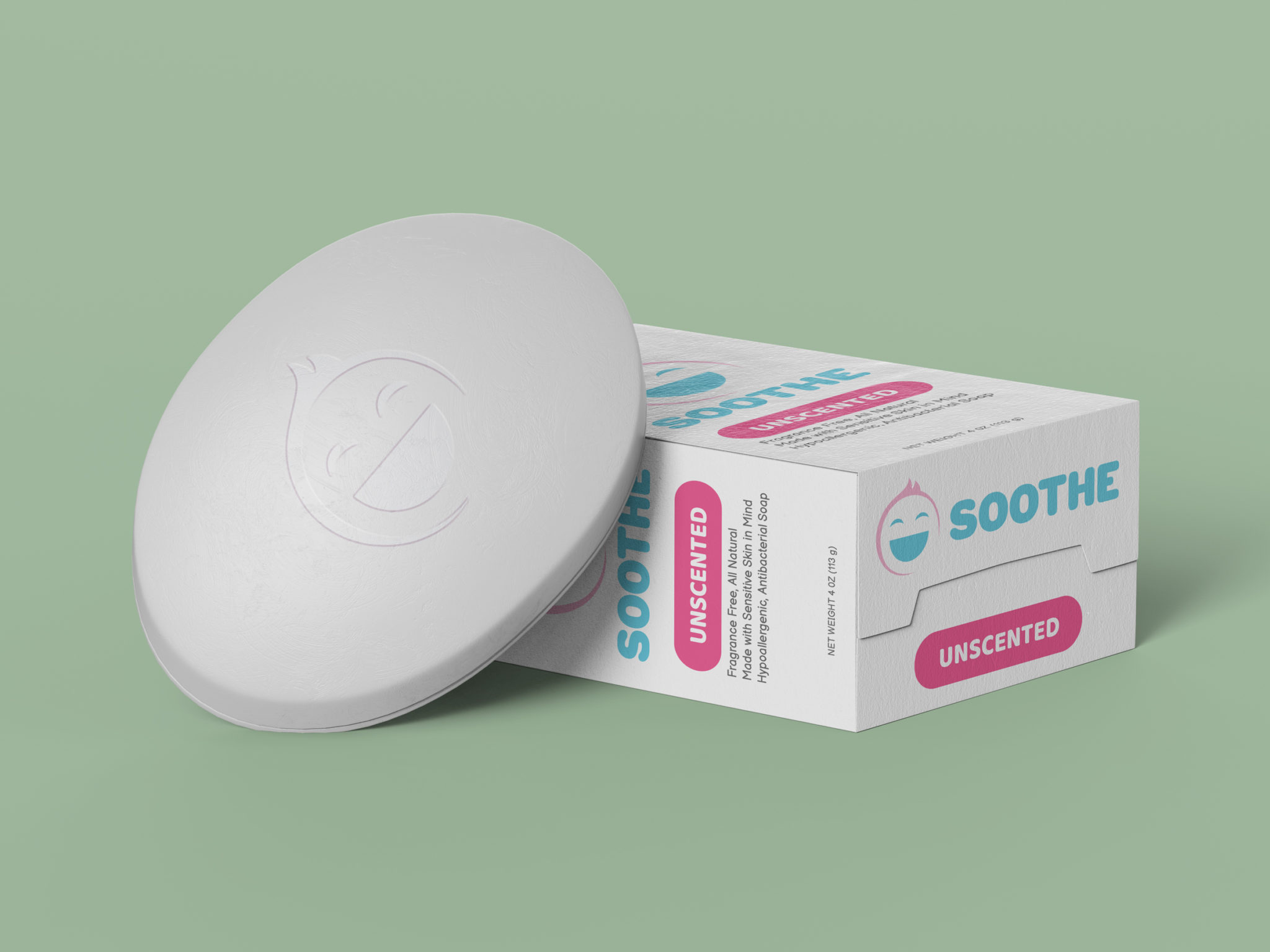
The perfect soap for children with sensitive skin. Unscented antibacterial soap that’s hypoallergenic and made with all natural ingredients! The layout for this piece was created in Adobe Illustrator with the final mockup being created in Photoshop.
BUSINESS CARDS |
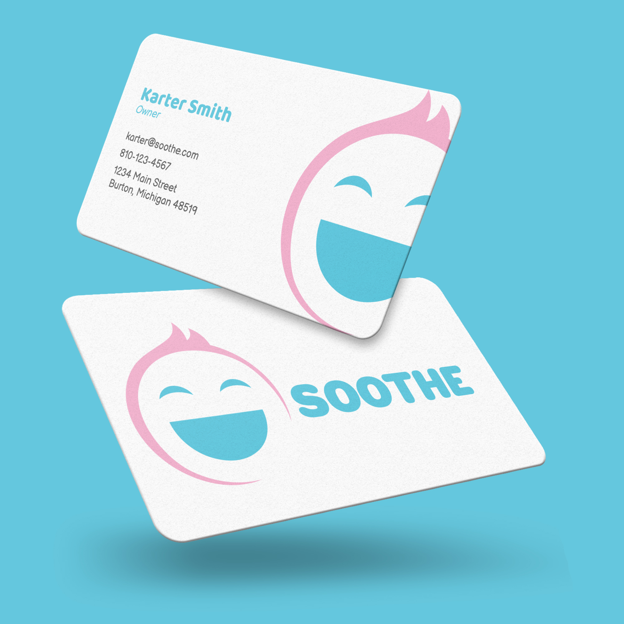
Here you will find a mock set of business cards with rounded corners. If these were printed, a thick matte stock would be preferred, possibly with a linen or cotton-like fiber for texture.
The decision to show rounded corners was made in order to keep the overall soft theme behind the brand continuous. Rounded type, round logo, finished off with round corners.
The card layout was created with Adobe InDesign.
VITAMINS |
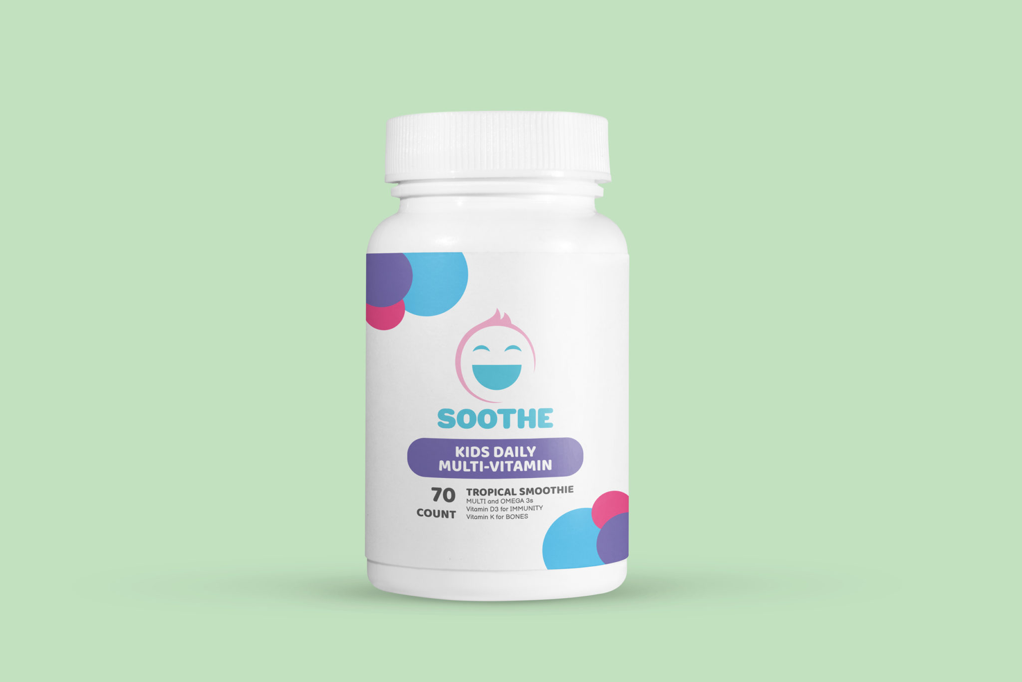
Keeping kids happy and healthy is Soothe’s mission…and it starts every day with a multi-vitamin! Here you will see a mock design of a vitamin bottle.
The layout was created in Adobe Illustrator while the mockup was composed in Adobe Photoshop.
TOPICALS |
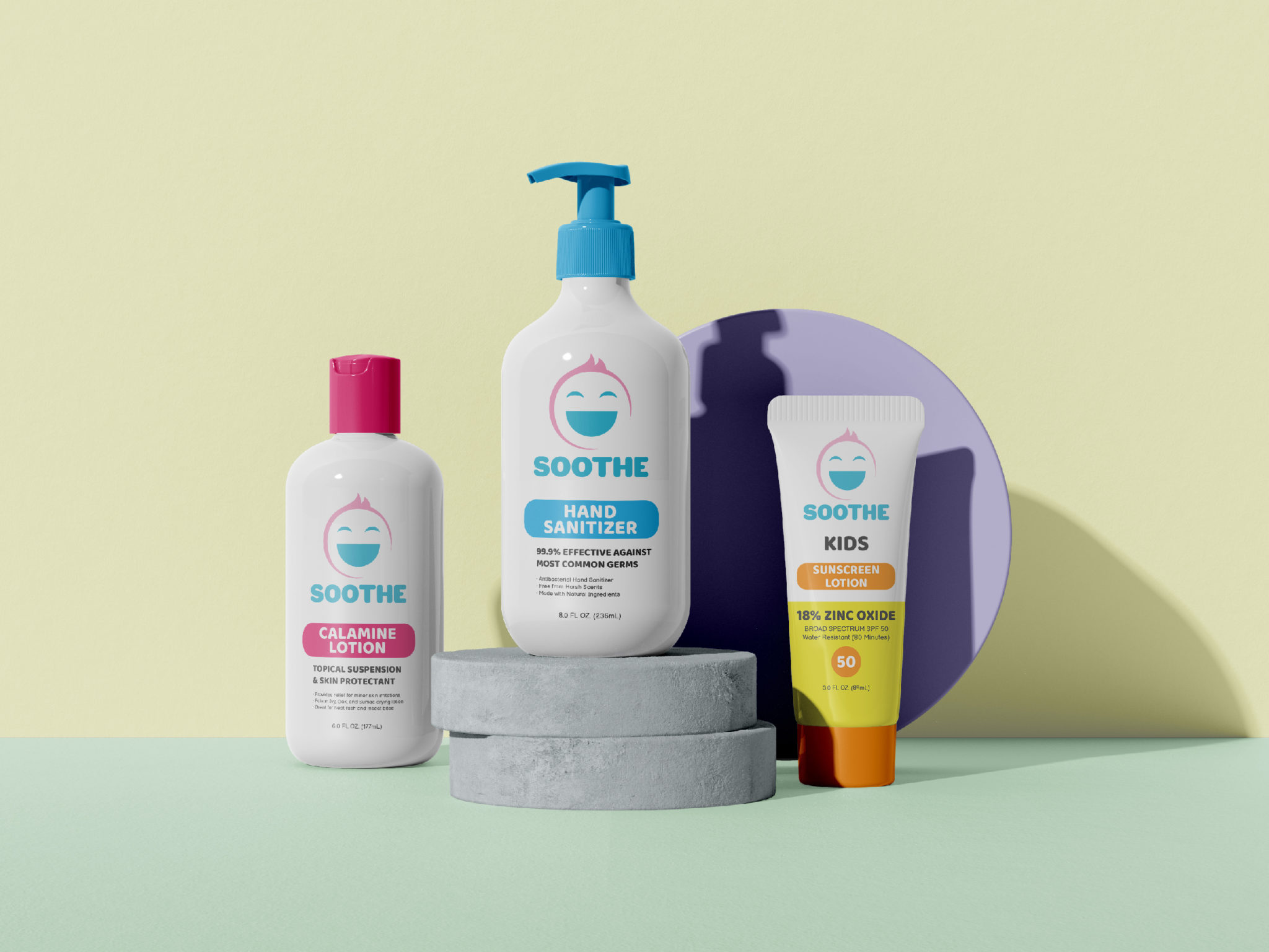
A collective mockup of calamine lotion, hand sanitizer, and sunscreen to display products made for children enjoying the great outdoors safely.
Each design was created in adobe illustrator before being constructed onto this mockup in Adobe Photoshop.
WEB APPEARANCE |
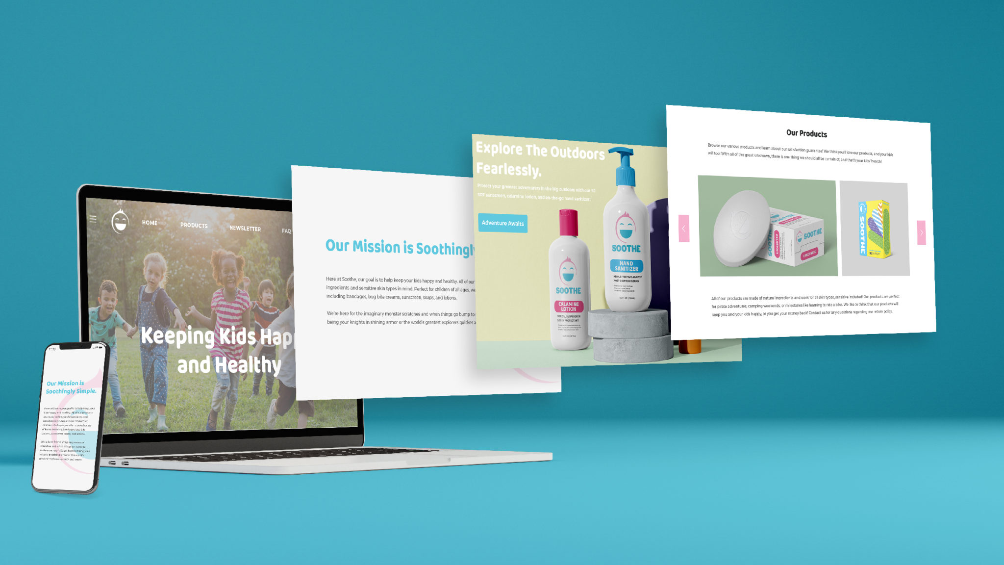
I created a web layout that would be used for both computer and mobile devices using photoshop. The layout consists of various mockups of Soothe’s products, alongside carefully placed elements such as the smiling logo with a 35% opacity in the large white sections of the image. The body copy is Montserrat, a current popular google web font. The header text is Baloo Tammudu 2 .
VIDEO AD |
Created using Adobe AfterEffects, this is a simple advertisement made for display on social media platforms such as Facebook or Instagram.
Royalty Free Music used from Bensound
ADDITIONAL PIECES |
Here are some other various pieces I made to explore further branding examples for Soothe. Created using various Adobe programs including Illustrator, InDesign, and Photoshop.
POSTCARD |
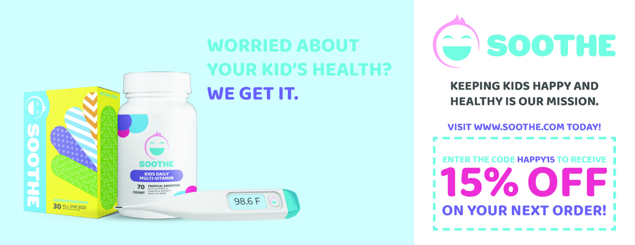
An idea of a mailer that could be sent out to encourage parents to use Soothe’s products and website. This was made in Adobe InDesign.
URBAN POSTER |
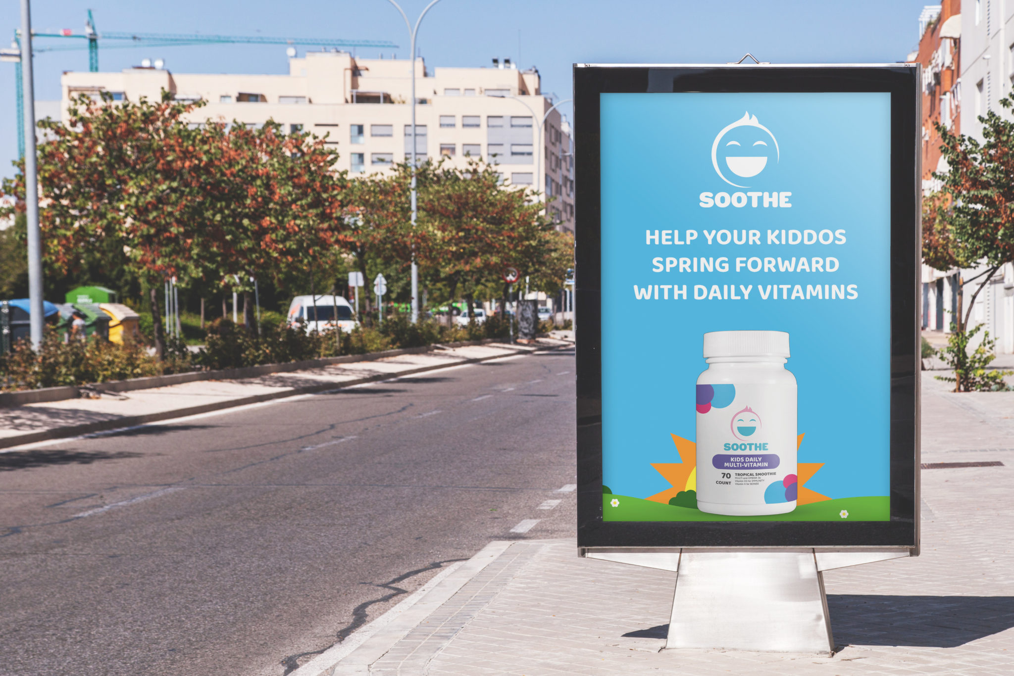
A mockup of the vitamins campaign placed on a poster stand that could be found along city streets. The background art was created in Illustrator with the vitamins bottle mock made in Photoshop. The mockup as a whole was composed in Photoshop.
BILLBOARD |
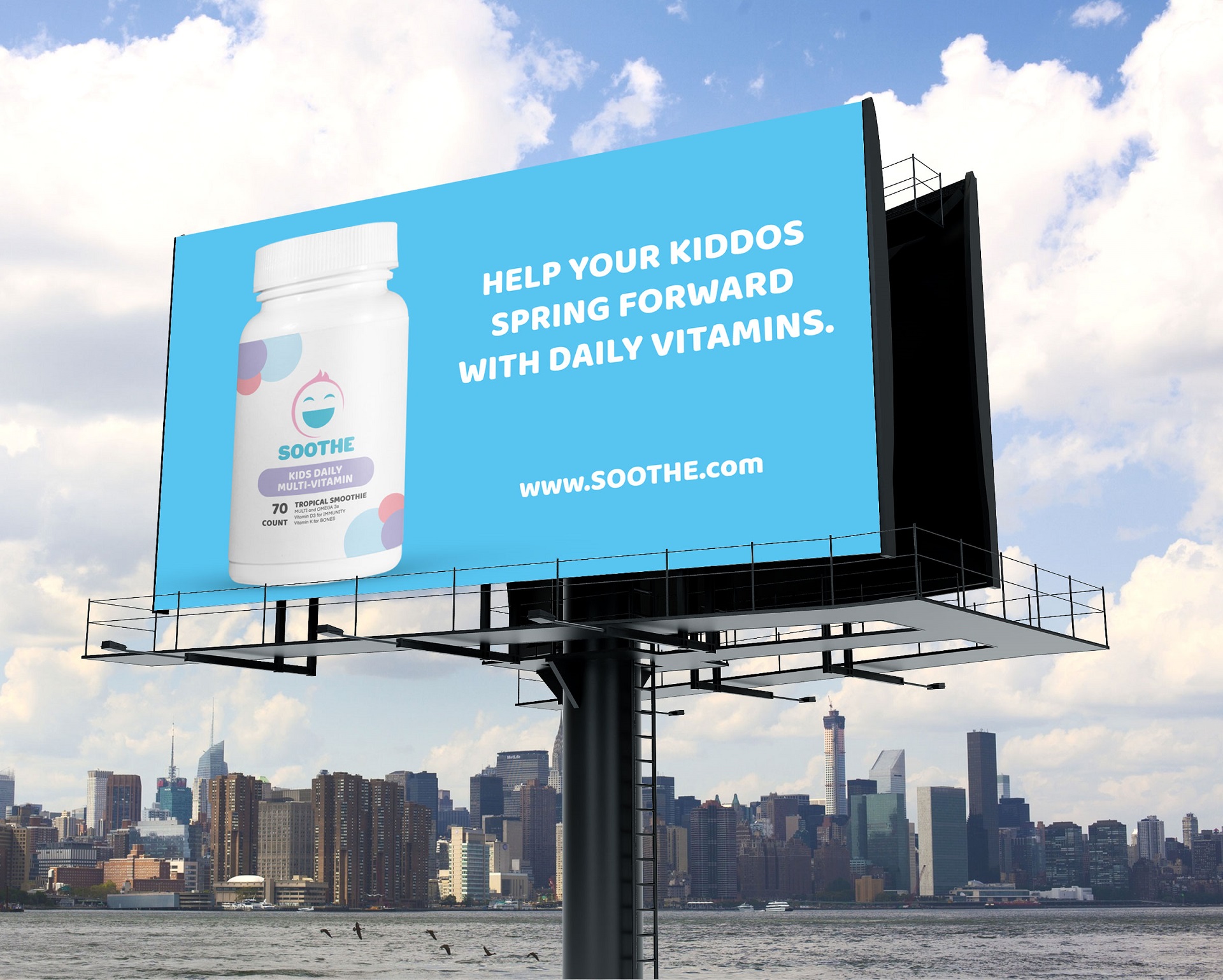
A billboard for the vitamins campaign to be displayed beside expressways or highways. This mockup was composed in Adobe Photoshop.
